ilert seamlessly connects with your tools using our pre-built integrations or via email. ilert integrates with monitoring, ticketing, chat, and collaboration tools.
See how industry leaders achieve 99.9% uptime with ilert
Organizations worldwide trust ilert to streamline incident management, enhance reliability, and minimize downtime. Read what our customers have to say about their experience with our platform.
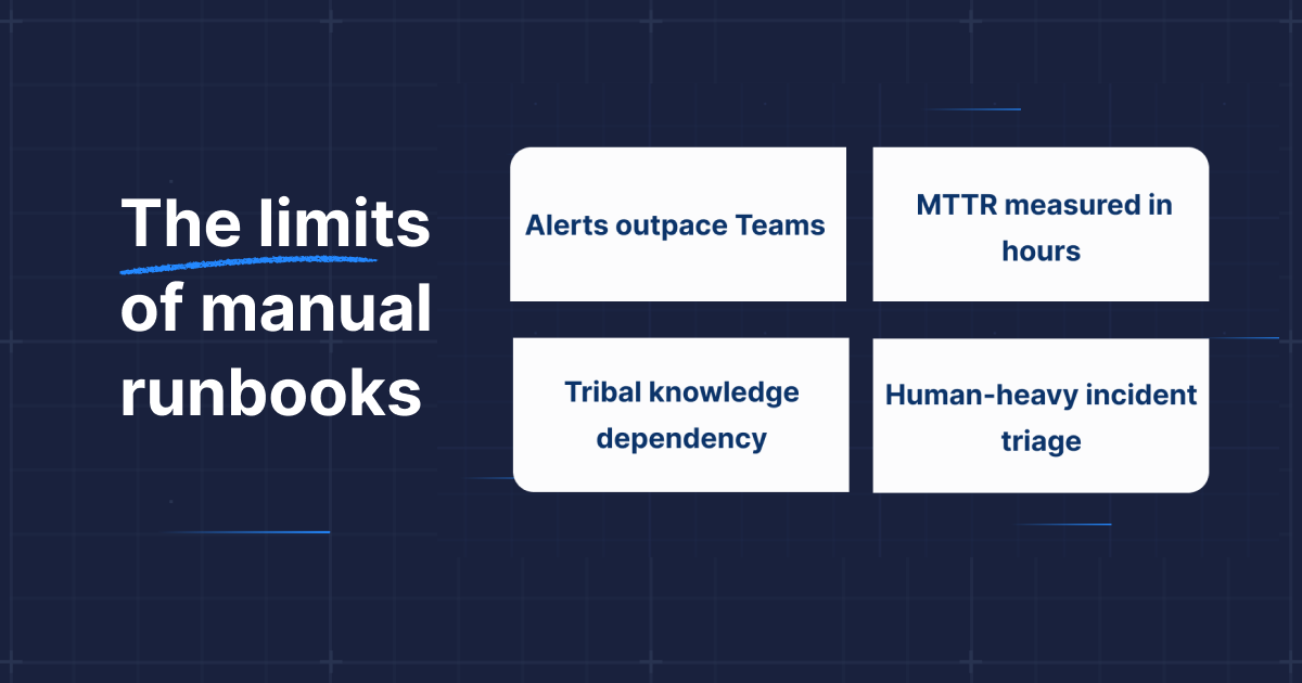
If you’re an SRE, platform engineer, or on-call responder, you don’t need another article explaining incident pain. You feel it every time your phone lights up in the middle of the night. You already know the pattern:
Noisy alerts that drown out real issues
Slow, manual triage
Scrambling through tribal knowledge just to understand what’s happening
You’ve invested in runbooks, automation, observability, and “best practices,” yet incident response still feels like firefighting.
Now imagine the same midnight page, but with AI SRE in place:
A triage agent instantly isolates the one deployment correlated with the CPU spike
A causal inference agent traces packet flows and identifies a library-induced memory leak
A communication agent drafts the root-cause summary
A remediation agent rolls back the offending deployment, all within seconds
What once took hours is now finished in a couple of minutes.
On-call engineers rely on scattered tribal knowledge
Every incident demands human interpretation and context
Modern infrastructure is too distributed, too dynamic, and too interdependent for static runbooks to keep up. The runbook era isn’t “bad,” but it is simply outgrown.
Why incremental automation fails
Most teams start adding scripts, bots, and basic auto-remediation. It feels helpful at first until you realize the complexity outpaces your automations. The complexity of modern infrastructure doesn’t grow linearly, it augments. Distributed architectures, ephemeral compute, constant deployments, and deeply interconnected dependencies create an ever-shifting incident landscape.
Automation often falls short because it’s brittle and struggles to adapt when incidents don’t match past patterns. As scripts decay and alerts accumulate, critical knowledge remains siloed, leaving only experienced ops teams able to distinguish real issues from noise. The result is that humans still spend most of their time triaging and chasing symptoms across fragmented tools. This leads to the firefighter’s trap, where partial automation actually makes manual work harder instead of easier.
Introducing the solution: from firefighting to intelligent response
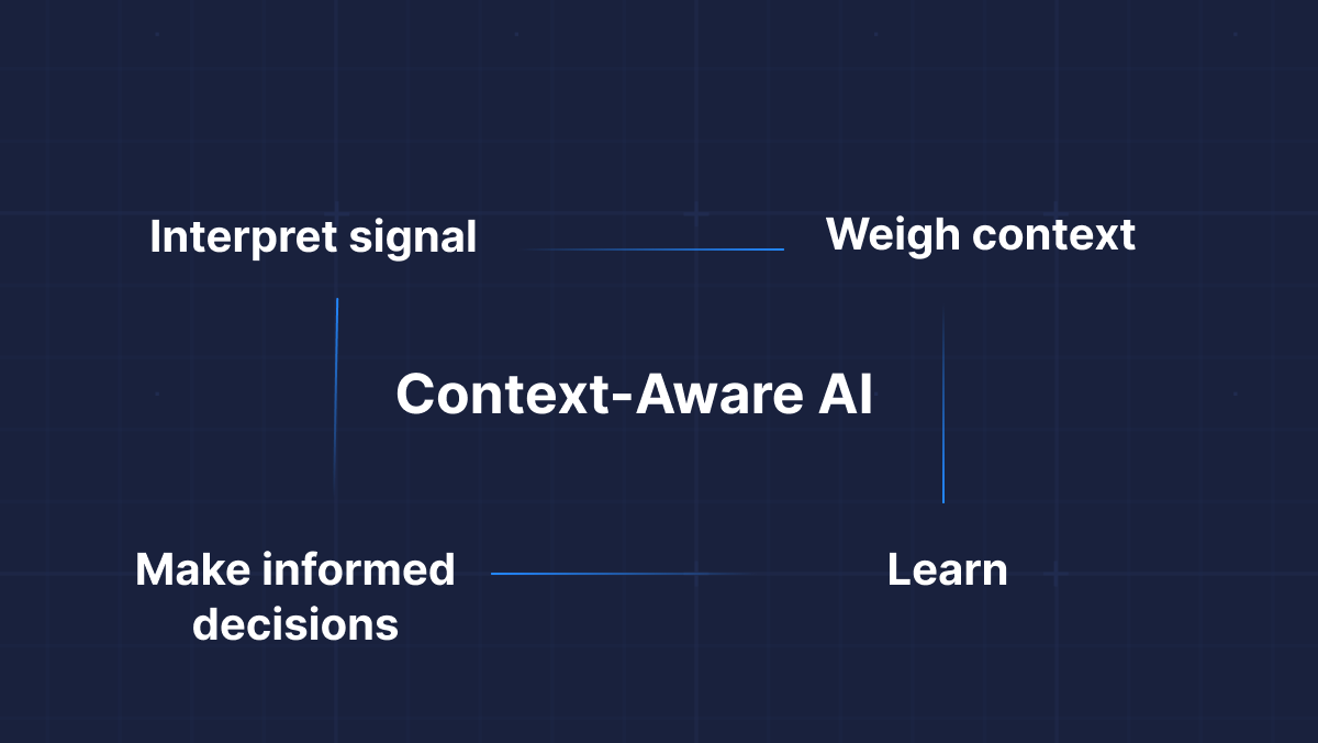
Teams now need a system that can understand their environment, interpret signals in context, and adapt as conditions change, much like a skilled medical team responding to a patient in distress.
This is the promise of agentic AI for incident response.
Unlike static tools that execute predefined rules, they offer adaptive, context-aware intelligence capable of interpreting signals, understanding dependencies, learning from each incident, and acting in ways that traditional automation cannot.
This brings us to the first major component of the AI SRE.
Context-Aware AI
An AI-driven SRE system introduces capabilities that manual and semi-automated approaches simply cannot achieve. Instead of following rigid, linear rules, the system executes multiple interconnected steps, adapting its behavior as situations evolve. With every incident it helps resolve, the system learns, therefore continuously refining its understanding and responses.
The future of incident response is not about replacing humans, but about amplifying human expertise. AI takes on the tedious, noisy, and cognitively exhausting work that engineers should not have to carry, allowing them to focus on what truly matters. Humans remain essential. Just as doctors rely on automated monitors to track vital signs while they concentrate on diagnosing the underlying condition, agentic AI manages constant background signals so engineers can apply judgment where it has the greatest impact.
Once a system reaches this level of understanding, a new question emerges: how does it operate across complex, interconnected environments, where a visible symptom often originates from an entirely different part of the “body”?
This brings us to the second major component of the system: the shift from linear incident pipelines to a dynamic, interconnected Incident Mesh.
The “incident mesh”
Imagine incidents as signals in a living network. Problems propagate, mutate, and interlink across services. Agentic AI embraces this complexity through an Incident Mesh model. Instead of flowing through a queue, incidents become interconnected nodes the system maps and manages holistically.
This mesh model allows:
Dynamic reprioritization as the scenario unfolds.
Localized “cellular” remediation rather than global, blunt-force actions.
Real-time learning and adaptation, with each resolved incident refining future responses.
Each agent owns a slice of the puzzle, much like a medical response team, with triage nurses, surgeons, and diagnosticians working together, not in sequence. This multi-agent approach only works if the underlying system is built to support it. Specialized agents need a way to collaborate, communicate, and hand off tasks seamlessly. And achieving that demands an architecture built from the ground up for multi-agent intelligence.
Blueprint: Architecting for agentic AI
Agentic AI isn’t a single bot but a coordinated system of focused, cooperating agents. Here’s what mature teams are already deploying:
Modular agent clusters: Root-cause analysts, fixers, and communicators act in concert.
Data-first architecture: Normalize (unify) logs, traces, tickets; protect data privacy via strict access controls and masking.
Event-driven orchestration: Incidents are broken down into subtasks and dynamically routed to the best-fit agent.
Built-in observability: Every agent’s action is tracked; feedback loops drive continuous improvement.
Human-in-the-loop fallbacks: For ambiguous, high-risk scenarios, the system requests confirmation before action.
This isn’t theory: these patterns are emerging right now at engineering-first organizations tired of “spray and pray” automation.
Breaking adoption paralysis: How to start the shift
Once teams understand what agentic AI is, the next hurdle is adoption, and many teams get stuck here. It’s easy to fall into endless evaluation cycles, feature comparisons, or fears about ceding control.
Real progress starts simple:
Audit your incident response flow. Log time spent on triage vs. diagnosis vs. remediation. What’s still manual? Where is knowledge siloed?
Pilot agentic AI where toil is greatest. Start with routine but painful incidents – think cache clears, noisy deployment rollbacks, mass log parsing. Keep scope narrow and fully observable.
Demand clarity. Choose frameworks where every agent’s action is logged, explainable, and reversible. No magic.
Continuously calibrate autonomy. Don’t flip the switch to autonomous everything. Iterate, review, and let trust grow from real wins.
Measure what matters most. Actual MTTR, alert reduction, and drop in human hours spent firefighting – not vanity metrics.
Once pilots start delivering tangible results, teams face a new question: How do we scale autonomy responsibly?
Adaptive autonomy
Autonomy is not binary. Tune it based on risk:
AI-led for routine, low-blast-radius fixes
AI-with-approval for sensitive or impactful changes
Human-led for uncertain or ambiguous scenarios
Teams, not vendors, should control the dial.
Cognitive coverage over alert coverage
Stop thinking in terms of “Do we detect everything?” Start asking: “Does our AI understand the system’s health across all relevant dimensions?”
Map blind spots, like unmonitored dependency spikes, just as rigorously as alert coverage gaps. This shifts the conversation from noise reduction to situational understanding.
With these principles in place, teams can expand AI SRE safely and confidently.
The point of no return: The next era through an SRE lens
Agentic AI marks a turning point for incident response. It offers a path beyond reactive firefighting and brittle automation, toward an operating model built on context, adaptability, and intelligent collaboration. For SREs and engineering teams, this shift isn’t about replacing expertise, it’s about unlocking it.
When the cognitively exhausting 80% is handled by capable agents, the remaining 20% becomes the space where human creativity, engineering judgment, and system-level thinking thrive.
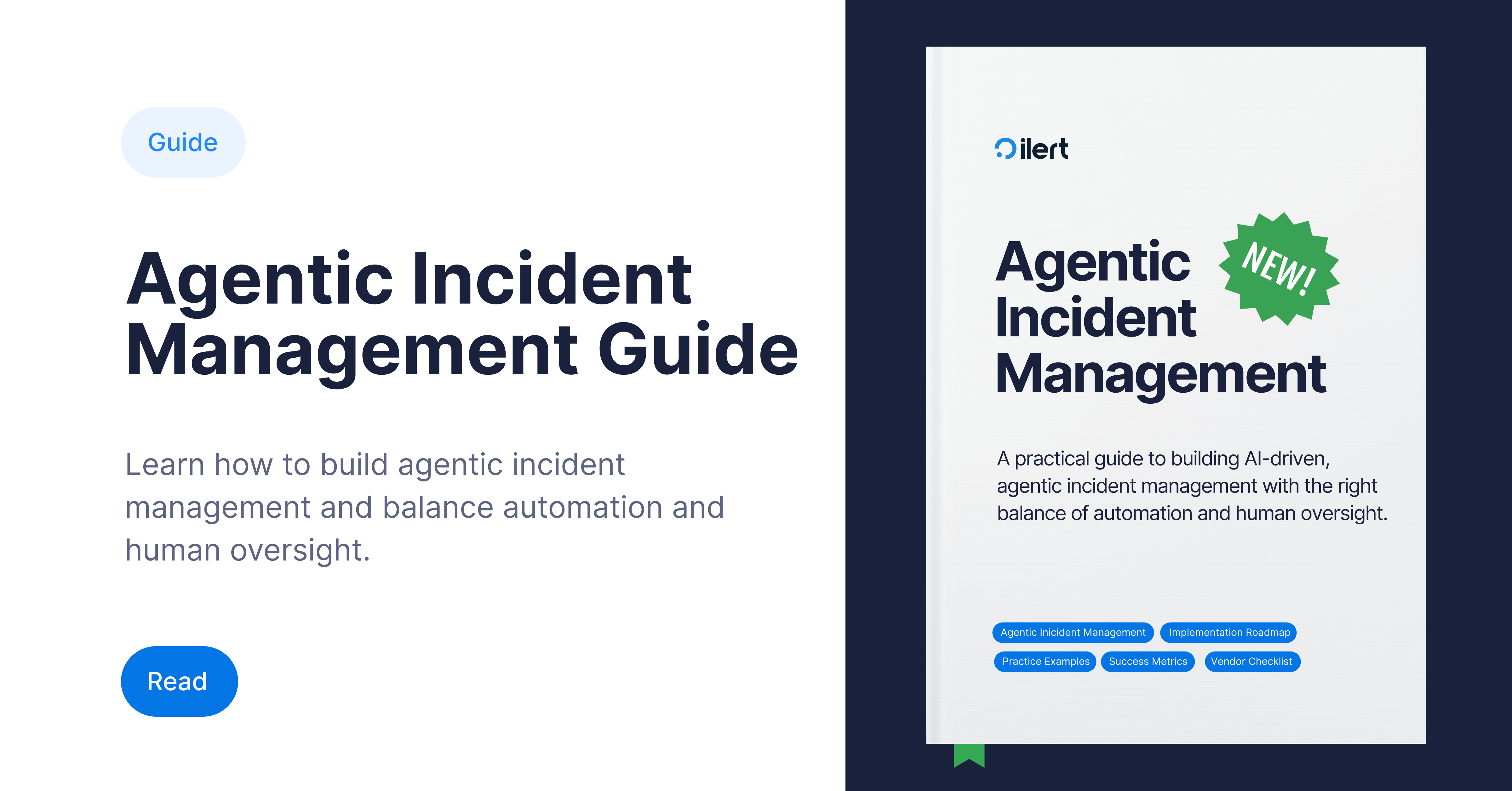
If this preview clarified what’s possible, the full Agentic AI for Incident Response Guide goes deeper. It covers the architectural patterns, maturity stages, and real-world design principles needed to adopt these systems safely and effectively. It’s written to help teams move from curiosity to practical implementation and ultimately to a reliability function that accelerates, rather than absorbs, organizational complexity.
The runbook era is giving way to something new. The question now is not whether this shift will happen, but who will lead it.
As we head into the holiday season, the ilert team is doing the opposite of slowing down; we’re ramping up. Over the past weeks, we’ve shipped a wave of impactful improvements across alerting, AI-powered automation, mobile app, and status pages. From major upgrades that reshape how teams triage incidents to smaller refinements that remove daily friction, this release is packed with updates designed to make on-call and operations smoother, smarter, and faster. Let’s dive in.
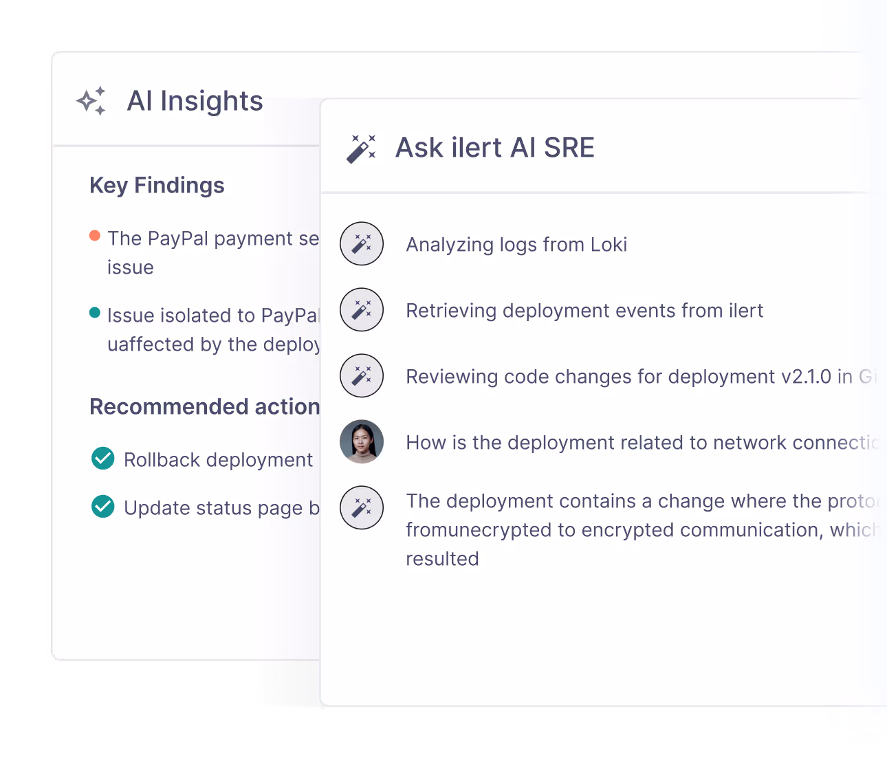
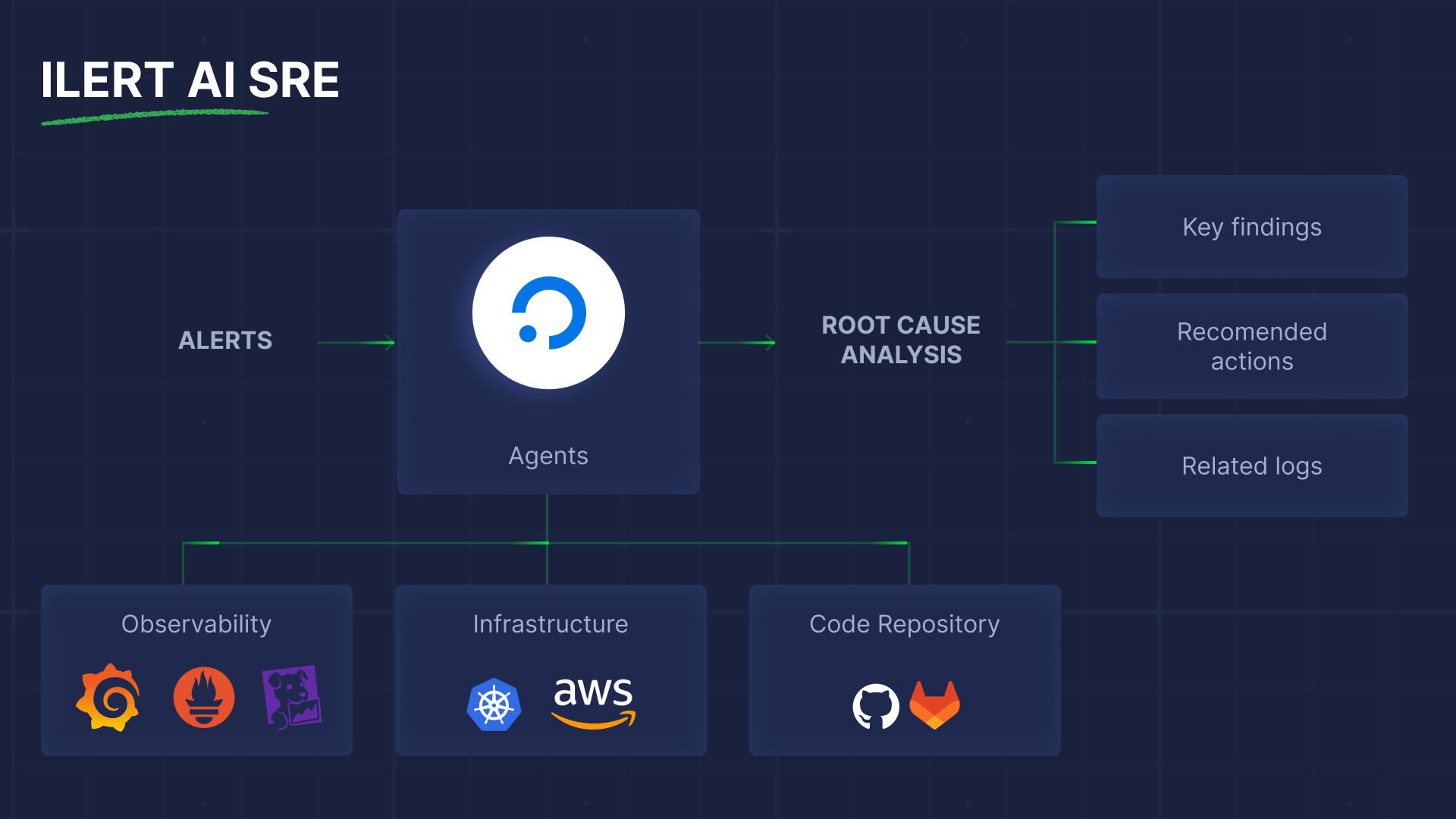
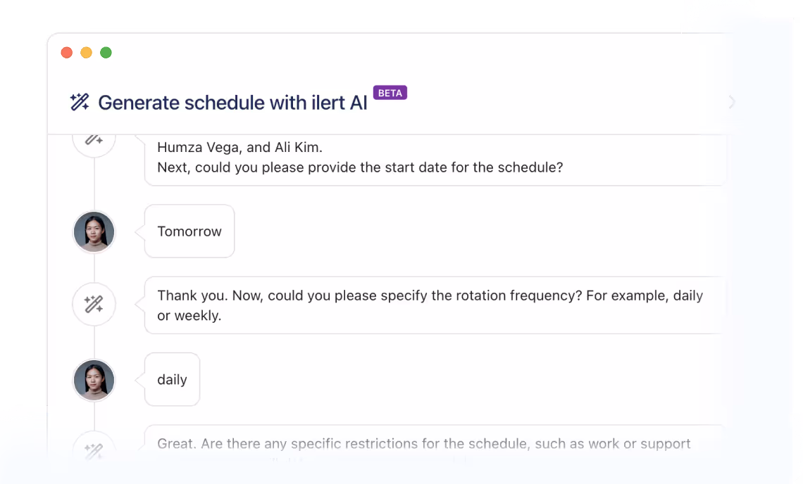
AI SRE: Your knowledgeable incident buddy
You probably remember us talking about ilert Responder – ilert's first intelligent agent that provides actionable insights during incidents. In the last few months, we introduced way more features, powerful agents, and capabilities, which are now all gathered under ilert AI SRE. So, what exactly has changed?
As the previous version did, ilert AI SRE can analyze logs, correlate metrics, check recent code changes, and propose recommended actions to you and your team to resolve the incident. Moreover, ilert agents can now also act autonomously, if you give permission.
While it might sound wild to give access to a production environment to AI, you will be surprised by how many issues require manual and quick fixes, rather than intellectual work. To reduce the burden of hand-operated tasks performed in the middle of the night and gain more valuable time for long-term sustainable fixes, you can start giving AI SRE gradual access and enable automatic actions such as rollbacks to the previous healthy version or restarting a service. To make it easier for you to identify different levels of agentic autonomy, we introduced three stages in our Agentic Incident Management Guide.
Under the hood, ilert AI SRE becomes useful because it integrates deeply with your existing monitoring, observability, and deployment tools. That means you don’t need to change your stack; you connect your existing tools and let the agent work across them. Everything starts with deployment events, as they allow the agent to correlate alerts with recent code changes and rollouts, which are often key signals for identifying root causes. You can check the article on how to introduce your CI & CD pipelines to ilert, if you haven't done this before.
The next step is to familiarize the agent with your observability data. For this, you will need to connect it to tools such as Grafana, Prometheus, Elastic, etc. It's pretty simple and straightforward. And as a final step of setup, you need to set the Root Cause Analysis Policy for the agent. We recommend beginning with a manual trigger to see the agent's performance.
When the SRE agent is in place, and the first incident occurs, you can communicate with it via chat on the right side of the alert view. Just as if you were talking to your colleague. Check the live demo of ilert AI SRE at Oredev Conference in Malmö to see agentic incident response in action.
If you want to be among the first to try ilert AI SRE incident response, just drop us a message at support@ilert.com.
Connect Claude, Cursor, and other MCP clients to ilert
With the release of the ilert MCP Server, integrating your alerting and incident management workflows into AI assistants has become seamless. The MCP server implements the Model Context Protocol, an open standard that lets tools like Claude, Cursor (or any MCP-compatible client) interact with ilert over a unified interface. Through this setup, your assistant can securely list alerts, inspect on-call schedules, acknowledge or resolve alerts, create incidents – all with proper permissions and audit trails.
Connecting is straightforward: you generate an API key in ilert, then configure your MCP client using either a remote HTTP transport. Find more detailed instructions in the ilert documentation. Once configured, ilert appears in the client’s tool list and becomes available directly inside the assistant’s interface. This reduces context-switching, shortens time to resolution, and embeds incident response directly into your team's AI-powered workflow.
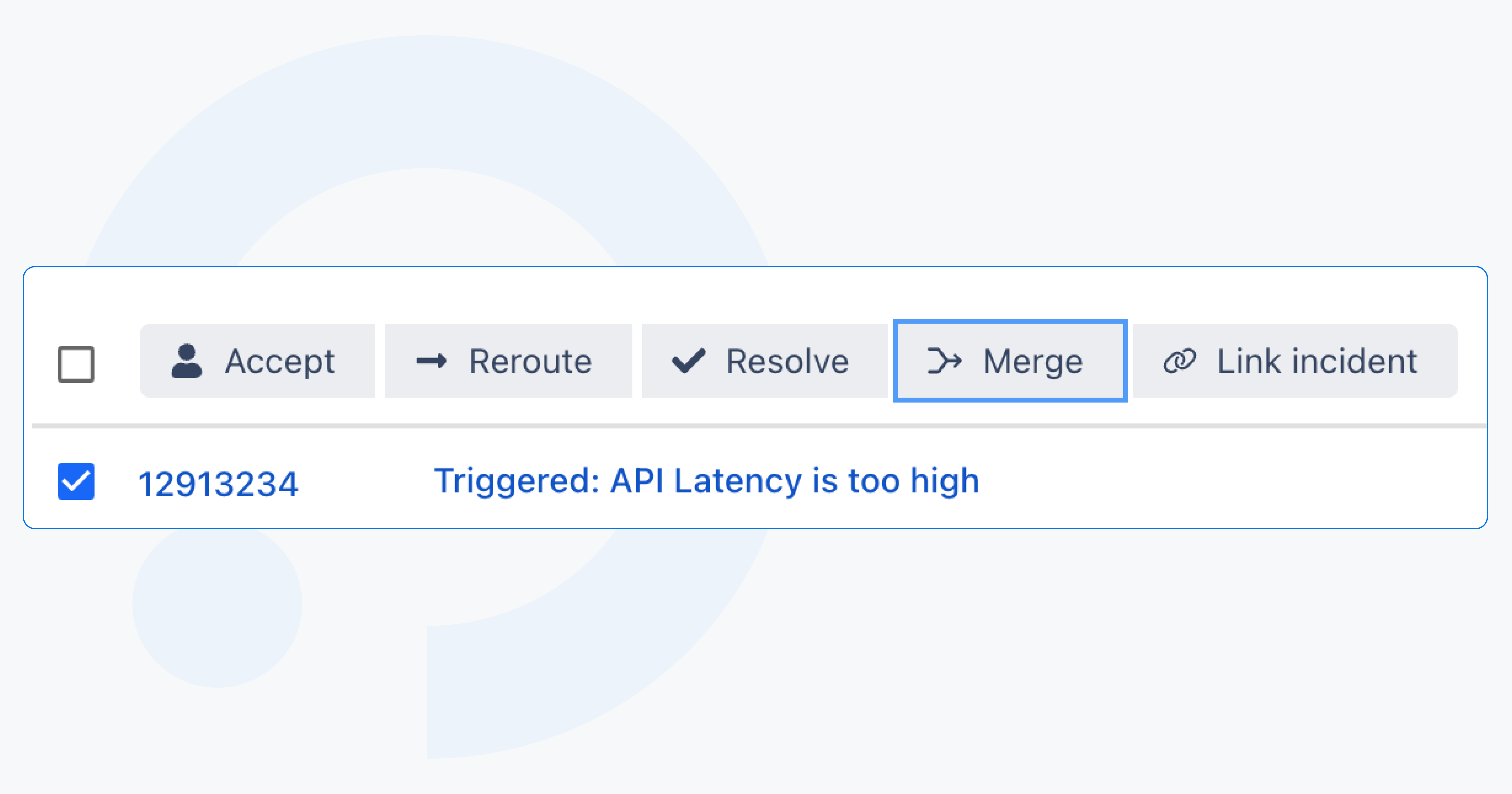
With the alert merge feature, you can combine existing alerts into a single main alert with one click. Merging stops duplicate escalations and notifications instantly, keeps responders aligned on one thread of communication, and preserves full traceability by keeping merged alerts available in the audit log. The result is a cleaner incident workspace, more accurate reporting, and a better foundation for AI SRE features – including automated merge recommendations during root-cause analysis.
Alert merge works hand-in-hand with event grouping: events merge into alerts, and alerts can now merge into one primary alert. Clear, intentional, and built to reflect how teams actually troubleshoot in the real world.
Filter alerts by labels for faster, targeted triage
The alert list now supports powerful label-based filtering, making it easier to zero in on exactly the alerts you care about. You can build filters using label keys and values with autocomplete, combine multiple conditions, and instantly see active filters represented in a compact ICL-style syntax. Editing filters is just a click away, and the same experience is available on mobile, so teams can slice their alert stream by environment, region, service, or any custom label from anywhere.
This brings far more precision to alert triage, especially for larger environments where labels are the primary way teams organize data across systems.
More alert filtering options
You can now also filter alerts by priority in both the ilert interface and mobile app. Whether you’re triaging from your desk or on the go, it’s easy to focus on the most critical alerts first and cut through noise from lower-priority issues.
Transparent alert grouping
To remove confusion caused by mismatched event counts, we’ve unified how grouped events are displayed across the platform. Previously, event grouping via alertKey and alert-source-based grouping were treated separately, leading to different totals in the alert list and alert detail views. The updated design consolidates these into a single, consistent event count, with clear grouping states and a detailed breakdown available in the Event grouping dialog. This ensures users always see one accurate number, regardless of the grouping method, and can easily understand how and when events were combined.
New Wait node for Event flows
Event Flows gain a powerful new control step: the Wait node. This addition lets teams pause a flow either for a specific duration or until the start or end of defined support hours. It brings precise timing control to automation, enabling smarter workflows, for example, delaying non-urgent actions outside business hours or spacing out retries with fixed wait times. The node respects support-hour configurations, including holiday exceptions, giving teams predictable, context-aware behavior.
This enhancement builds on the foundation introduced in our recent deep dive into Event Flows. The Wait node expands what’s possible with flow automation, helping teams design more reliable, human-friendly processes.
Responsive grid layout for large-scale status pages
Status pages now support a third layout option – the responsive grid – built for organizations managing hundreds or even thousands of services.
The new layout introduces a high-density grid optimized for large service catalogs. On wide screens, services are arranged in up to 12 columns within a 1536px content width, creating a clean, scannable overview. As the screen size decreases, the grid adapts seamlessly: tablets display fewer columns, and mobile switches to an icon-only mode for maximum clarity. Crucially, this layout supports all key elements such as active incidents, past incidents, metrics, and service grouping, ensuring teams can communicate status effectively at any scale.
For enterprises with sprawling architectures, the responsive grid makes status pages both performant and user-friendly, turning massive service inventories into a readable, navigable experience.
Mobile app news
Handling coverage requests on mobile just got smoother. Until now, many users didn’t realize that the top section in the coverage request flow acted only as a search filter. This meant they still had to manually adjust each identified shift in the list below before sending the request – a common point of confusion reported by several customers.
With the latest update, ilert mobile now applies the selected search boundaries to all matching shifts by default. You can still fine-tune individual shifts if needed, but the default behavior now reflects the intent expressed in the filter. The result: fewer taps, less ambiguity, and a more intuitive coverage request experience.
The heartbeat list in the mobile app no longer appears empty: we’ve migrated both the list and detail view from relying on alert sources with integration-type filters to using the dedicated Heartbeat Monitors API. This ensures your monitors are displayed correctly and in real time, aligned with how heartbeats are managed across the platform.
And a few minor but still eye- and heart-pleasing updates.
We revamped the outbound integrations (also familiar to you as alert actions) catalog. You can now see all features relevant to each connection, and it's easier to navigate through the list.
Additionally, alert action logs now show which alert and alert source each action relates to, and you can filter by these references to drill into exactly what happened, faster.
Status page email notifications now support Markdown, making it easier to format updates clearly and consistently. Bold text, lists, links, and other lightweight formatting options render correctly in outgoing emails, so teams can share structured, readable incident updates without switching tools or rewriting content.
Custom processing rules templates now behave in a way that better matches how teams actually use them: conditions only evaluate as true when a real template is present (for alertKey or any of the create/accept/resolve actions). Combined with new out-of-the-box templates for the most-used integrations, this means less guesswork, fewer “empty” conditions, and faster rollout of consistent, high-quality alert payloads.
And finally, our ilert mascot – the blue froggy – has a fresh look across the entire interface. Enjoy its brighter, more colorful style every time you open ilert.
The end of the year brings pressure. (Oh, we know!) Customer demand spikes, response expectations stay high, and engineering teams are juggling production issues, releases, and time off. For many teams, this is when on-call becomes chaotic: schedules break, notifications hit at the wrong time, and coverage gaps appear exactly when you can’t afford them.
ilert's Holidays and Support hours features were built to fix that. They simplify on-call management, protect your team’s time, and keep organizations running smoothly.
In this article, we’ll cover how these features help to stay in control, prevent burnout, and create predictable, reliable schedules even during the busiest seasons. And at the end, you’ll find a practical bonus chapter: how to stay healthy, sane, and avoid burnout during this pre-holiday rush.
End of the year – a crash-test for your on-call routine
On-call management gets complicated when support expectations vary across regions, customers, or time zones. Add holidays and PTO season on top, and teams often resort to spreadsheets, Slack pings, or “please cover my shift” chaos.
End-of-year operations already demand tight focus. Yet many teams still patch schedules manually with spreadsheets, emails, or Slack threads. These small improvisations add up, pulling engineers and managers away from solving the real problems and into administrative firefighting.
Holidays and Support hours solve this by giving teams precise, automated control over when alerts should trigger and who should handle them. The result: fewer interruptions, cleaner routing, and schedules that reflect real-world availability.
Let's first look at the Support hours feature.
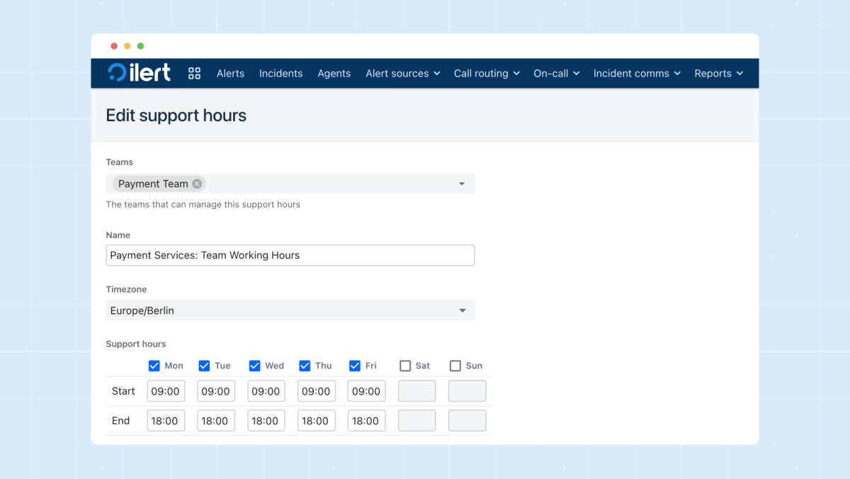
The Support hours feature in ilert lets teams define exactly when alerts should fire and how they should be routed using time-based rules. It acts as a guardrail that checks whether an event happens during business hours, outside them, or during specially defined windows. This allows teams to tailor behavior depending on urgency: critical incidents can escalate 24/7, while lower-severity issues can quietly wait until the next morning.
Support Hours can be simple (weekdays 9–5) or highly structured with multiple blocks, time zones, and logic layers. They’re ideal for organizations with different SLA tiers, global customer bases, or engineering teams who want to protect nights and weekends from non-urgent noise.
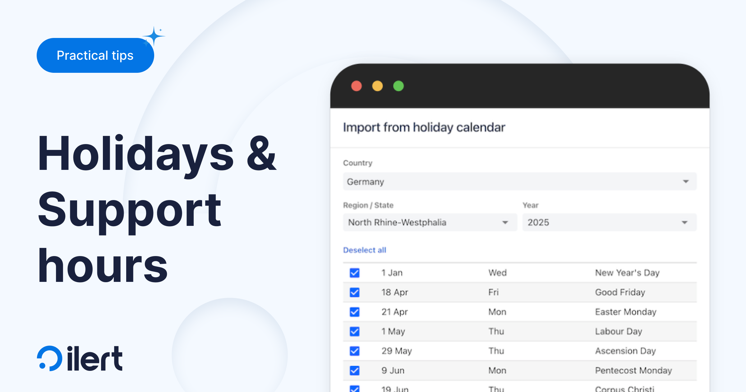
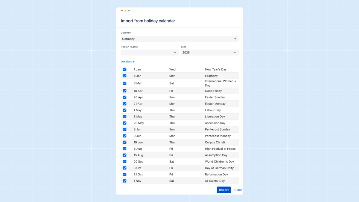
Holidays take this concept further. Internally, we jokingly call them “Support Hours on steroids.”
They let teams automatically exclude national holidays, company-wide days off, or regional observances from regular support windows. Instead of manually adjusting schedules every time a holiday rolls around, ilert matches your service hours with the relevant holiday calendar and automatically adapts routing.
This is especially powerful for distributed teams with country-specific holidays, or anyone who was accidentally paged on Christmas morning. Holidays ensure your escalation flow reflects the real world: fewer surprises for engineers, and cleaner operational coverage when the office lights are off.
Here is why your future self will thank you
We established Support hours and Holidays for fundamental reasons. We receive numerous support tickets daily, but December is a unique peak season, and we understand the challenges our customers face. Do any of these sound familiar to you?
Coverage gaps appear at the worst time. With engineers taking well-earned time off, gaps in coverage become inevitable unless schedules adapt automatically. Without that automation, the burden shifts unevenly; someone ends up carrying extra on-call weight, or – worst of all – an engineer gets notified during their holiday. These gaps hurt morale and directly slow down incident response when uptime matters most.
Manual fixes drain time you don’t have.Year-end work already demands focus, yet many teams still scramble through spreadsheets or Slack threads to patch schedules. These last-minute adjustments consume engineering time that should be spent on stabilizing systems, shipping features, or preparing for traffic spikes – not babysitting calendars.
Escalations become noisy and inaccurate.When support hours and holidays aren’t fully integrated into the on-call logic, alerts fire at the wrong moments. People get pinged outside business hours, or urgent issues quietly fall through the cracks. In a peak season full of customer activity, misrouted alerts escalate quickly into incidents, impacting customers and leaving unpleasant red spots on your status pages.
International teams feel the complexity even more. Distributed teams deal with a patchwork of national holidays, cultural observances, and regional support-hour rules. Without a system that adapts to each region’s calendar, some teams get overloaded while others are unintentionally under-utilized. This imbalance becomes especially dangerous when global usage spikes.
Customers don’t pause their expectations. Even while internal teams slow down or go on vacation, SLAs keep ticking. Customers expect the same level of responsiveness, and any misalignment between support contracts and on-call coverage becomes painfully visible. Poorly controlled support hours during the busiest season don’t just inconvenience engineers – they damage trust.
Bonus: 8 tips for engineers on duty to avoid burnout during the pre-holiday rush
Enhance your alerts. Clean up noisy monitors, retire outdated checks, and tune thresholds before traffic spikes. A quieter, more accurate alert setup pays off massively during high-stress weeks.
Automate what you can. Small automations, such as log parsers, deployment scripts, and error-notification filters, save hours when systems get noisy.
Use rotations effectively. Make sure on-call responsibilities are distributed fairly, and that holidays are properly reflected so no one works a stretch longer than they should.
Rehearse failovers and edge cases. Run quick simulations or tabletop exercises with your team. Knowing how systems behave under load removes guesswork when real issues hit.
Configure safety nets. Enable auto-remediation where appropriate, make sure backup contacts are defined, and double-check that escalations route correctly if someone is unavailable.
Share context proactively. Post short updates in Slack or your incident channel about ongoing issues, infrastructure changes, or known risks. The next person on-call shouldn’t have to rediscover what you already know.
Lean on your tools. Features like Support Hours and Holidays exist to reduce mental load. Let them do the heavy lifting so you don’t have to think about schedules or routing.
If an incident happens, debrief faster. Short, focused post-incident reviews help teams resolve patterns quickly without sinking hours into analysis.


