

Pitfalls when migrating desktop components to a Progressive Web App
.avif)


When the mobile app is a Progressive Web App (PWA) and shares a common codebase with the desktop web app, porting components from web to mobile often requires only minor adjustments to align with platform-specific nuances. However, this seemingly straightforward process comes with its own set of challenges. In this article, I’ll explore some of the common pitfalls to watch out for when migrating components.
By the way, if you are curious about what framework we at ilert use for our mobile app, read our article “Ionic vs. React Native: Which one should you choose for mobile apps?”
What is a Progressive Web App (PWA), and why is desktop-to-mobile migration straightforward with it?
Feel free to skip this chapter if you have already worked with PWAs.
A Progressive Web App, also known as PWA, is a web app that combines the best of both worlds. PWAs use modern web capabilities like offline support, push notifications, and installability while running in a browser. Since a PWA shares a single codebase across platforms, moving components from a desktop web app to a mobile PWA is often easier than moving to a fully native mobile app. Many components can be reused with minimal changes, just adapting to touch, screen sizes, and mobile UI patterns. However, while the shared codebase saves development time, user behavior and platform constraints still require thoughtful tweaks to make it seamless across devices. So, let's see what are those constraints.
Touch vs. click / Finger vs. cursor
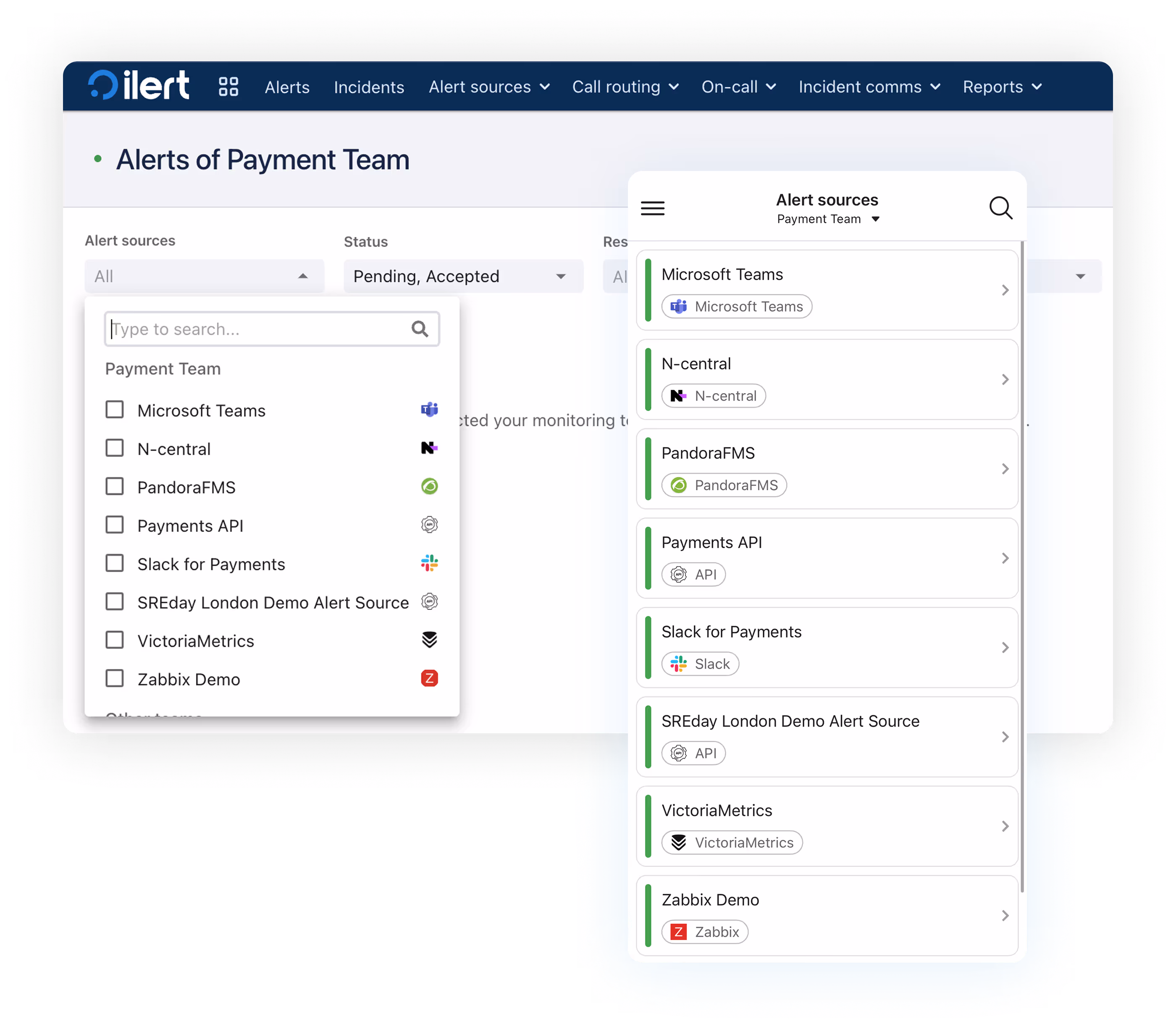
The most obvious but still crucial difference is how the user interacts with desktop and mobile applications. For accessibility, action areas in a mobile app have to be bigger. Hovering over components is not available with touch, only in a focused or active state.
For example, in a web app, a dropdown menu with hover effects works well because users can precisely navigate with a cursor. On mobile, the same dropdown becomes frustrating to use. Instead, a modal or a full-screen menu with large touch targets is a better solution.
In the web app, the code for this component in JSX would look something like this:
1<Popover>
2	<PopoverContent>
3		<Stack>
4			<Searchbar />
5			<List />
6		</Stack>
7	</PopoverContent>
8</Popover>
9
Transforming this component to mobile, using the Ionic framework, this looks in JSX like this:
1<IonModal>
2	<IonHeader>
3	   <Searchbar />
4	</IonHeader>
5	<ModalContent>
6		<IonList>
7			<IonItem>
8				<IonListHeader>
9					<IonLabel>Option 1</IonLabel>
10				</IonListHeader>
11			</IonItem>
12   		  	…
13   	 </IonList>
14	</ModalContent>
15</IonModal>
A Modal ensures full-screen content, while the List with items provides large touch targets. If less customization is necessary, Ionic also provides another component specifically for dropdowns, which leads to even easier migration:
1<IonSelect value={selectedValue} onIonChange={handleChange}>
2	<IonSelectOption value="option1">Option 1</IonSelectOption>
3	<IonSelectOption value="option2">Option 2</IonSelectOption>
4	<IonSelectOption value="option3">Option 3</IonSelectOption>
5</IonSelect>
A similar problem occurs with tooltips. On the desktop, users can hover over items, and tooltips appear with additional information. No hover is available for mobile devices. Holding over items suggests an action menu rather than a tooltip with brief text. In such cases, it’s better to display information without hiding it or using another modal).
Visual differences
Mobile screens are smaller and allow content to grow only vertically, while web apps usually have more space horizontally. Thanks to the screen sizes, content can grow in both dimensions.
For example, in a web app, a navigation bar displays all menu items horizontally. While on mobile, the same navigation bar collapses into a hamburger menu to save space.
Another example is when working with popovers: while popovers are sufficient on the web app, on mobile, they often don't have enough space to display their content. This becomes even clearer when one of the components inside the popover is a dropdown menu, requiring another modal on mobile. The solution here is to stack multiple modals over each other, providing enough space for each component to be displayed.
Performing actions
Navigating with a cursor allows for more precise movements and clicks, reducing accidental actions. On mobile, the combination of small screen size with touch results in more mistakes when using an app. To tackle this problem, mobile apps often need confirmation steps and smart placement of action buttons.

While the accept button at the top is sufficient for desktops, having it at the bottom of the action bar makes it accessible to click with the thumb.
Steps to Migrate Desktop Components to a Progressive Web App
The final migration from the desktop app to the PWA depends heavily on the complexity of the components, the final use case, and whether a component library is used.
Roughly, these steps should be followed:
- Identify reusable components
- Replace hover states
- Implement touch actions
- Simplify interactions if necessary
- Check whether orientation change is needed
- Scaling fonts/visuals for screen size
Using a component library (like Ionic) immensely helps in the process as it offers a platform-specific style change to match the device while also providing native functionality. However, if components and design are consistent across devices, further work is needed, and a custom solution from the start may save a lot of migration work.
.avif)


